Monday, December 10, 2012

Reflection: One World Flag


TechnicalI used a sphering distort in order to make the countries fit on the planet better. Then using the clone brush and a star pattern I created the inside of the planet. Highlighting the edges of the countries I'd made earlier then switching layers to delete the edges of the star system gave me the stars in the shape of countries on Earth. After gettnig the basic layout I made about 260 shapes, all of them clean stars using photoshop's shape tool. The old stars look like a goopy mess, the new stars are all clean and perfect. The background was a simple vector and colour combo, nothing fancy.

Idea or Concept
I wanted to highlight the stars that surround every part of the planet. Universal was a word in my planning process and from there I used galaxies and nebulas until I finally settled on stars. My idea barely changed throughout the development of the image, though Matt's suggestion of adding chevrons did alter my image for the better. I did fiddle with a lot of combinations though, having tones and heavy lines representing the world, eventually settling on countries. Universally progressing forward is the theme here, and the colours are all appropriately complimentary. Every colour blends smoothly with one another.

Influences
The artists behind Brazil's flag were the ones to inspire me. They made a planet-like object in the middle with Spanish words surrounding it and from seeing that I knew it would be good to have a planet with its surrounding universe in the center of it. Their flag has the perfect layout for a global flag. The stars in the planet made me want to represent countries with stars.

Composition
My art is generally in the center. Like the UN flag, we're centered within ourselves. The lines are horizontal and the countries are all around the image, but everything goes back to the center. There aren't suns or moons in corners or other assymetrical features. The viewers eye therefore goes around the image then returns to the world at its core. If I were to aim any differently in this project I would have the four corners with appropriate logos to represent unity and peace, but it would be hard to find appropriate images that don't prefer one country over another.

Motivation
I was motivated by Brazil. They made a beautiful piece of work and I wanted to make something equally good for an imaginary united world. They were my competition and I was motivated to usurp them. Other motivations lay in making a flag with continents that looked pleasing to the eye while conveying the importance of the surrounding universe in the planet.

Critical Assessment
The best part of the image is a toss between the stars representing Earth's continents and the chevrons that tie the image together so well. Between those I'd say the stars in the planet were the best executed part. The chevrons were surprisingly good when I included them as a joke. They fit perfectly and with orange they fixed the composition very well, while being a representation of progress. With additional time I would not change anything. I've been given far more time than I should have had to finish this and for many hours I replaced colours and added silly graphics that did nothing to improve my photo. It's perfect in being simple, adding things to it will not improve it, it will hinder its simplicity. As an evample of what I've done here are a few alternate designs I made. From a distance the chevrons were far more noticeable, therefore they worked much better in a flag situation. The stars were too small in the flags below, and had I made them bigger they would have become distracting and taken away from the simplicity of the flag.


Thursday, November 29, 2012

Brainstorm: One World Flag

1. The average flag has about 3 colours. Characteristics of flags include colours that contrast well with each other, such as the French flag or the German flag. Colours do not blend with each other. Many flags hold animals and nature in them, others are based around simple shapes and colours. The most notable shapes are rectangles and circles. In order to make a realistic flag using stars or stripes I'll have to turn up the contrast until the stars have completely lost any tones. The milky way may be difficult to incorporate unless I can somehow make the characteristic swirl into a simple shape.

2.

Universal

Together

Complete


Undivided

Obamacare


I'm going to have a dark blue circle in the center that contains the world countries, the outline of the countries are going to be there but replacing the solid ground will be the stars of our sky. Might even change it to the Milky Way to represent ourselves. On the top left will be our sun peeking out and the background will be green, possibly cut into the basic outline of our countries to drive the fact home. It depends on how cluttered it will look.
Kudos to Brazil for making a great, inspirational flag.


Wednesday, November 28, 2012

Interactive Architechture Assignment Reflection

Technical
I have done a LOT on the technical side in this assignment. It's crazy, so I'll break it up a bit.

Photoshop
Adjusting colours to get brighter whites and less yellows. Adjusting the lights to be singular (so I can move them around in flash) and tweaking the blur to look better (coming clearly from the roof, and blurry near the floor). I had to re-blur and select a smaller area about 10 times in order to have the "gradual" blur effect. I separated the equalizer, lights and letters to be manipulated later in flash. I had to make sure they were opaque (so I could adjust transparency later in flash, simpler) and resized them to fit the image better.

Flash
From the get-go I wanted everything on as few frames as possible. I was tired of dealing with frames 1-300 just to get a simple effect. Therefore from the start I knew I had to start using/abusing graphics and movie clips. I also had to learn a bit of actionscript in order to get the flashing letters to pop up only when holding down the button. In order for that I had to use functions wherein 0 meant the light was off, and 1 represented completing 1 animation. After letting go of the light it will complete its revolution and revert back to 0, turning off. The buttons were easy frame switches, goto-3, goto-5, easy stuff. The sounds were actually the worst part of the animation, and I could have kept it to 4 frames had it not been for them. In order to get the sounds to stop playing when switching between frames I had to insert a "stopallsounds" script. This script got in the way of all sounds on that frame though, so I had to make one frame into "stopallsounds" and the next frame to "playsound-1". Most of everything else shown is clever use of movie clips and loops. They're simple enough and controlled by the frame you're on.

Idea or Concept
My idea barely changed throughout the creation of my piece. I added small modifications and adjusted the disco-floor idea, but otherwise it's mostly interacting through sound and touch. The disco-floor looked horrible. Honestly terrible. I couldn't make the floor look realistic and I couldn't make it look GOOD, or fun to be on. So I scrapped that idea and turned it into a panel of flashing lights that the viewer could hold down and see the SACRED HEART flash in their colour of choice. Another slight adjustment was the stage lights that changed colour based on the volume of the viewer. This matched well with the equalizer to show just how much the viewer can interact with the medium.

Influences
Matt barely influenced me this time. He was well and busy. In fact I was my own inspiration for the majority of the project. I'd be pensive and wait for a good idea and spring into action when I thought of delivering the concept well. I was my own motif, my own idol.

Composition
The art was mostly symmetrical. Looking at the panel you see a solid grid, the equalizer was a large solid line, the lights were all in a nice even row, even Matt (hopefully the viewer projects themselves unto Matt) stood directly in the center of the piece. The piece is assymetrical with the angle and how the lights and panel are placed awkwardly around one another, but at its heart it's a symmetrical piece. I believe the sides compliment each other. The viewer feels safe knowing each side is comfortable being around the other, which in turn makes the viewer feel comfortable. It's in this state of comfort that my art piece truly feels appreciated.

Motivation
My motivation was the pursuit of bettering myself in Flash. Despite having an older program I still pulled off some good feats. Being better at an older program lets me be even better in newer programs with more features. I'm glad to have improved this much in Flash, and I know this is solid ground to start working on my portfolio. I'll most likely bring a newer version of Flash to school though, at minimum Macromedia Flash 8 (most reliable version). Though I was glad to work simply for the goal of bettering the work. Making my art stand out in a crowd is pleasing and is its own reward. Were I not able to motivate myself to animate I would not pursue art, I would pursue a desk-job that I wouldn't need motivation for.

Sunday, November 4, 2012

Part 6: Idea board for portfolio

Part 5: Creative Portfolios


http://salleedesign.com/home/
Sallee has a lot of cute graphics throughout his blog that mix well with his professional side. He seems to be aiming for simplicity while keeping a light tone. His blog is creative for having the moustaches, moving parts and unnecessary fun bits, but it also maintains an air of professionalism and isn't difficult to navigate.

http://www.jamesgarner.co.uk/
Garner has little animations and he blends all of his links with his artwork. He even made it possible to scroll through his entire portfolio, all of his links are on one big page.  His art is in there too, specifically "Doug" and how you shouldn't mind him being there at the bottom of the sea. This work is littered with small animations and other creative pieces.

http://andrewhandley.com/
The perfect example of a creative portfolio that stops using simple text and easy navigation. Most useable buttons are in the same area, but they're not listed with text. Some things don't even make sense, such as the atom in the center leading to the comic. This portolio presents the artist's style alongside his actual art.

http://www.hugosocie.fr/
Hugo uses a newer style in their portfolio. It reflects the style Windows has chosen in their new Windows 8 operating system. Large squares of art with colours that contrast greatly. Thankfully text is shown in this portfolio and it's easier to navigate than other harder portfolios. The squares have bright little triangles that rise when hovered over, showing how simple and elegant the artist is.

http://s19382.gridserver.com/
This artist has a really incredible 3D navigation that can be controlled entirely with your mouse. Moving around you can see every bit of their art all in a big circle, scroll through and choose exactly which pieces you'd like to see. The background is a viginette (which is coming back in style) and it helps to highlight the art in the center. Clicking on any of the art takes you to a separate page where it's shown fullscreen. This is an amazing, simple creative blog that's also easy to navigate.

Part 3: KROP portfolio

http://www.krop.com/quintonb/

Part 4: Professional Design


http://lisasolonynko.com/
The site is easy to navigate with the images being the center of attention. Eyes are directed toward the box scrolling through her recent works, but it's easy to navigate away from using the tabs on the left. You're also able to scroll through her art easily and comfortably using the scroll wheel when hovering over the box. Interesting, simple, and professional looking!


http://www.sharonruttonsha.com/
Clean interface with no transitions between the art. Everything is simple and layed out professionally on the left. There's often only one or two clicks between seeing any art on her portfolio. The colours are muted compared to her works and the text is all easy to read.

http://www.ellacharette.com/realism-artwork/
The site's important links are all layed out at the top in an easy-to-use format. Nothing is out of the way and when clicking on one of her listed arts, you're immediately directed to all of the art with no text separating them. It's all clean and efficient, nothing confusing or hard to navigate. The font is also pretty clean and easier to read than Sharon Ruttonsha's.

http://www.ddgadjanski.com/index.html
DD Gadgjanski is looking for the cleanest, simplest portfolio. The fewest words possible separate the viewer from the art. The interface is clean and the images change with a soft blur. Font is clean as it's white with a black border, easy-to-read on all colours.

http://www.biankaguna.com/
This may be the best looking interface. A plain white background with everything perfectly centered, the text looks nice (despite it saying "collections" instead of "gallery") and all of her art is all displayed on the appropriate page. All information is simple and it's obvious that her art is the main focus.

Wednesday, October 31, 2012

Interactive Architecture brainstorm

A. I believe the gym could benefit greatly from coming alive. People in the gym are not interacted with, they sit in a seat and wait to be entertanied by whatever is on the stage. Offering a visual medium which the audience can influence. Keeping an audience happy between performances could be great, as they could potentially never be bored.

B. I believe adding lights to the walls and roof of the gym could benefit the audience. Adding giant lit-up equalizers to the walls could offer the audience a way of interacting with the gym through sound. It could also spice up a dance as the walls themselves are brought to life. Another form of interaction could be pads (glass squares in the floor with LEDs underneath them) that light up based on how much pressure is applied to them. This could even make for an interesting game of twister!

C. The equalizer could show teenagers that yes, they're being heard. Their voices reach all around them and the gym shows that they can be listened to. It can even entertain them. If teenagers need an outlet they could stomp on the LED floor and yell at the LED wall, having both the floor, the walls and the entire gym change in reaction to them. For catholics they can talk to the wall and have it react to their words. Catholic people could meditate on the LED floor and tell their prayers to the wall.

D. The viewer speaks to it. He goes up to it and if he's calm and talkative, the equalizer visualizes this, showing a very calm speaker. If he yells angrily at the wall the equalizer flares up to the roof of the gym in response, reflecting the viewer's emotions. It could also be a way for speakers to tell how loud they are and whether they're reaching the back of the gym or not. The LED floor could be used to incorporate the audience into the presentation. The speaker may want a red stage so he could get the audience down there to stomp on the ground and it would cause the gym to change colours.

Tuesday, October 30, 2012

Adbuster Image + Reflection


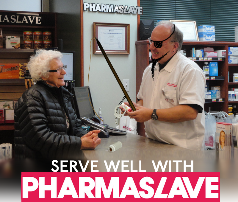
Technical: I split letters apart to create the Ls in Pharmaslave. I figured I wouldn't be able to find the fonts through searching, or at least it would have taken far too long. Cutting and copying was the best choice. Getting the logo in there at the bottom required me to copy/paste the lower part of the photo and stretch/blur until it looked acceptable. I figured it would be better than having the photo stop abrubtley to fit the logo in.

Idea or Concept: I got the idea while walking through the hallways. Seeing a girl wearing her "pharmasave" uniform I laughed to myself, calling it "pharmaslave". Then I figured I'm a genius and used it as my adbuster. My ideas consisted mostly of handcuffs/pharmaslave logos in order to convey the theme. As I progressed I figured it would be good to show a pill bottle with handcuffs spilling out, to show how much control drugs have over the average consumer. We're an overmedicated society in my opinion.

Influences: I really liked the Coca-Cola adbuster with the bottle of Coke being shot at the asian man. I wanted to show something like that. Maybe I'll redo this assignment later with a darker theme or picture.

Composition: Most of the focus is actually in the middle of the picture. Although I did adjust things in other places to subtley show the control medication has over the consumer. Most of the focus is in the center and after a quick look you're essentially done looking. I'm actually fairly disappointed with this image despite having a good idea to begin with. I would definitely redo this assignment with the same "pharmaslave" idea and a different, darker theme.

Motivation: Personally I loved my idea and wanted to see it into fruition. It would have been a pretty funny, clever thing had I been able to show it better. I believe I'm going to sketch something out soon as I'm getting a much better picture in mind the more I think about it. In the end my motivation had been drained and I started playing with the image. This is why the slave driver (cashier) is a pirate. I want to explore what slavery would look like offered through pill bottles.

Critical Assessment: I'd say the pirate's face is one of the most successful parts of the image. Terribly funny looking. Otherwise I'm proud of the big "pharmaslave" up at the top of the image, because I had to adjust pre-existing letters and shift everything over, manipulating shadows and the wall in order to make it look real. The pirate part was definitely the most surprising part of the piece. I was not expecting it to look good, and I'm glad it exceeded those expectations! I kept it in for its light tone and humour, and it even fits pretty well. With additional time I would redo the entire assignment. There would be a man on a stage pouring a bottle of pills over a crowd. The pills would expand and a giant dark hand would be layed overtop of the pills. The crowd would be cheering with handcuffs on their wrists, casts and other assorted medical problems. Pills being the "answer" to all of them, with a single smiling man handing out everything. This would far exceed my current picture.

Monday, October 29, 2012

Interactive Architecture Pre-Assignment Reflection

a. Monomyths: My favourite piece of the house? Most of the house is actually unappealing. But the most interesting part would be the heads that pop out and display old stories. It's a bit of an invasion of privacy, but it's meant to be a creepy look into someone else's private life. The heads light up when emitting sound, and it seems you can pull the heads out closer to you so you can kneel down and give them a ki- observation. Observe their faces and stories. The combination of movement, sound and lights all make for a more interesting piece than the mirror that shows you the past (3 seconds into the past. Mind-boggling.) and the seat with a soundboard.  I'd say if I were to make a piece it would deal with sound being the interactive bit and lights to show how you're affecting the piece.

b. LED ceiling: The world's biggest LED screen can be art by influencing the viewer. Art is meant to affect people, make them think and question. Some pieces of art are just big black cubes with no marks, no identifiable artists or interesting designs. The entire piece is a blank masterpiece meant to make the viewer think, and it does this well. A giant LED screen can influence the viewer, lighten their spirits, make them think differently, and even advertise to them. It would be a way to transport people to a different place of the world, so for fleeting moments they're no longer in a mall, they're in a sea of stars blinking and unblinking. Watching stardust in the wake of boats that travel overhead. This LED screen could be a window to the artist's mind.

c. Ocean of Light: This is a pretty interesting piece of technology. It could make the viewer feel different when evelopped. In a sea of red they could feel scared, or angry. The lights from the cieling invoke emotions based on the colours and being wrapped in the lights forces the viewer to think and feel differently. It can also make fleeting moments of wonder and awe at pleasing fireworks and designs. Though it doesn't have too much usability aside from flashy-lights looking pretty. It's art in the way Final Fantasy 13 is good-looking. It's a pretty painting until you look at it from the side and see it's entirely two-dimensional. There's no depth beyond the pretty colours.

Tuesday, October 9, 2012

Post-Apocalyptic World


Before:


After (final, finished image):


Technical
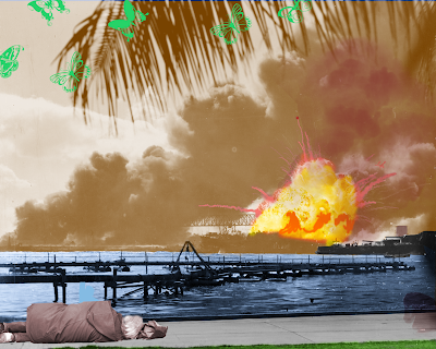
I used many layer filters. The hard mix filter combined with a gradient changed the image completely. That hard mix layer was just above the background, so any layers above it where unaffected by it. That way I could put dots and butterflies above the layer without them becoming corrupted and odd. The explosion was done using a colour filter or linear burn filter, making sure it was detailed and red. Filters were used all throughout the image. To make the silhouettes of people escaping from the explosion in the water I had to find pictures of people jumping and I filled their outlines with a colour, afterwards adding a gradient to make them blend better with the water. And a concept you showed to the grade 11s during the course was some feature where you could twist objects around, contorting them to the wickedest of shapes. I used this feature to curl the poster of "THIS IS THE ENEMY" around the sleeping person.

Idea or concept
I really wanted to highlight the explosion. Despite it being in the background, I wanted it to be immediately important to the viewer. I wanted to show nature in the image (represented by the butterflies). The posters on the ground were supposed to show the society that crumbled during the apocalypse. What I really wanted to show was a strong military presence. I wanted to have a Nazi representative or some other strong general in the picture. As I added to it, I realized I wouldn't have room for the general without the image being too cluttered, so I scrapped that idea. As I fiddled with the layers and their filters I changed the colour scheme and the overall feel of the image. You can see from the "before" and "after" photos that I tweaked almost everything as I developed a vision of what I wanted from the image.

Most of my original ideas stayed strong though. Nature is there, war is there, decay is there and propoganda is there. Pretty much everything I wanted in the beginning still exists, the improvements I made were in the presentation.

Influences
I had no influences on the particular assignment. The closest "influence" per se was Matt's opinion, which I took very seriously and adjusted my picture accordingly. I had nothing in mind when I started yet as I completed it the image took its own shape. Making this particular image was like shaping clay. I'd weave my hand around the clay as it spins on the wheel and despite starting without a clear shape in mind, I'd finished with a nicely proportioned pot. It required no influence. I knew what I wanted, a pot regardless of its shape, therefore when sculpting it I gave it the best shape I could while maintaining the fact that it was still a pot.

Composition
I made this image to be asymmetrical  I wanted the viewer to circle around the image. If you take it apart you can see three distinct parts that I worked on separately. Toss them together and the viewer appreciates one piece of the triad, moves on to the next, then moves on to the next. I layered the composition as much as I layered the actual image, and dear lord did I have enough layers. A quick scroll-through reveals about 30, so I definitely worked at piecing it together fluidly. My eye moves in a circle. Specifically across the three distinct areas of the image. At least I believe it's a circle because of the emphasis on the explosion then my tendency to check out the butterflies shortly after, in contrast.

Each individual piece has its own level that I was working with. But I did not intend for any level to be a specific depth. I did not want the viewer to see things in the average 3D style. I'm tired of that, it's boring, everyone sees 3D and says "Great! Now our cubes can have real depth"! I want my image to remain 2D with the 3D aspects improving specific bits. I put emphasis on parts that mattered by putting them in red. For other parts of the image they remained their natural colour because I'm not going to sacrifice a good looking image for the sake of "Golly jee 3D!!".

Motivation
I wanted to produce my own good-looking 3D image. This would be all my work and could properly show the potential these glasses have. When I'd show my blog to friends this image would be the one to impress them. Essentially, I did this for bragging rights.
As with most ideas I made the most of a "pop art" feel. I figure that's what works best as it offers a stark contrast and the 3D glasses work really well with objects that contrast. I wanted to have elements that were more than just in a background and foreground, I wanted to mix them together to create more than just a sense of depth. Using 3D to create a better looking 2D image was what I had in mind. The water wasn't red or green because I don't care for how 3D the water looks, I care for the aesthetic feel of the water. I want people to  look at this and see a relatively nice image, then I want them to put on their 3D glasses and be impressed as the green butterflies combine in the background and the explosion bursts forth to greet them.

Critical Assessment
I feel like the most successful part of this image was the effect of the explosion. It shows a real amount of power and force behind the bomb that struck. Having it in the foreground impacts the viewer really well. Another good part of the image is the clouds. I'm really proud of how perfect the outline is on them. The butterflies also work really well as they're green and don't look very cluttered when wearing the glasses.

The change introduced by a single layer with the "hard mix" filter really surprised me. You can see the difference between the first and the last image being mostly done by introducing that one layer and tweaking the colours. It's actually really sensitive, and tweaking the brightness or saturation of that one layer affects the size of the cloud, the outline of it and the brightness of the sky.

I'm not sure what I'd do to improve my work. I'd need additional inspiration or ideas in order to improve it. Even then I'd likely get rid of other elements in order to make room for the new ideas. The image is already too cluttered to me. Adding to it would be a mistake. Getting rid of certain parts of the picture in order to improve the overall quality would be what I'd do given more time.

Monday, October 1, 2012

Post-Apocalytpic World: Brainstorming

a. I'm thinking the world can't end, this planet has an incredible way of surviving through everything. The only way the world could "end" is if it ended for ourselves, the resources applicable to our survival dwindle and our world ends. The rest of the world will undoubtedly survive. The most plausible scenario in my mind is that we kill each other. There won't be a slow decay in our world, the end will be from a Cold War or a World War III. So, in my scenario, the world ended during the Cold War. Most of the planet is still green, most of the wildlife is still around, but the majority of the population has died and every large city has become a smoldering crater. And as Einstein said, World War IV will be faught with sticks and stones, therefore I want post-apocalyptic survivors to have a war with these tools.

b. I think everyone's going to act as they do when settling in a new land. People will do whatever they can to survive, and that includes working together really well, which will cause the wars to be far worse and the rebuilding to be far better. Companionship will be important. People will pretend to enjoy each others'

c.
  • Nature's going to be just fine after a nuclear war. I'm being completely serious, grass will grow anywhere and will settle far before people do. Therefore I can't see the world being a brown desolate crater, but I can see it being filled with destroyed buildings and structures.
  • I can see important politicians and celebrities surviving in fallout shelters, people like Obama, the congress, Stalin, and not-Harper.
  • People will wear decayed jeans and t-shirts, raiding Wal-Marts for clothes. None of this leather-skinned shorts and other ridiculous things that so many post-apocalyptic scenarios portray. People aren't going to start wearing cow-skulls just because the world's been blown up.
  • Music will survive. People will create instruments from anything.
  • Garbage will become the easiest material used to create art.
  • Some nuclear warheads and military institutions will survive.
  • Larger, fish that hang out lower in the sea will survive. Possibly breeding other fish that can live closer to the surface, regardless of the level of radiation. These would be some scary looking fish. So I'll just use a jellyfish instead.
  • Pearl Harbour will survive, giving me a proper location for all of this to be placed.
  • Our old culture will survive, and so will the powerful symbols of our history. This will be represented on the soldiers.
  • Tenth and final thing that will survive: Puppies.

d. My symbol of hope will be music's survival. There will be a small group of actually happy people trying to rebuild society around the people who have managed to keep music alive. The politicians, decayed jeans and nuclear warheads should be oppressive and disheartening, with the music being a "chance for survival". Much like my Mario Kart picture I want this done on two layers. I want the top layer to have society as it is with oppression and post-apocalyptic damage, and I want one cut-out corner that sinks inward with the people who hope for a better society.

e. Their art doesn't have much detail, and the landscapes are mostly about rebuilding things. I don't see how they portray the world after an apocalypse. Society looks to be just building new structures, not surviving a nuclear fallout. This could be relabelled "Saskatchewan" or "Sudbury" and have the same, if not better impact.

Sunday, September 23, 2012

Building Your Digital Portfolio - Part 2: Pitch

An amateur who aspires to be a professional digital artist, excelling at Flash and Photoshop with an eye for both detail and clarity. One day I hope to work alongside studios as renowned as Disney or Studio Ghibli.
a. Good at Flash, making vector drawings and animations (not vector animations though, that's ridiculous). Enjoy making photoshops. Able to make fairly good looking pencil drawings. I have an eye for details. I enjoy making clear pictures, ones without too much clutter or obstructions. I'm a patient worker who'll spend hours before settling on a design or animation, and my work clearly improves over that time.

b. I hope to be a graphic designer. I want to work with animators from studios like Studio Ghibli, or Disney. I want to create beautiful drawings and animations that inspire thought and emotions. I want to be featured on the albums of artists, or in the credits of a movie I helped create. There are a lot of artistic goals I can put as what I'd like, but I'll basically summarize it as becoming a professional. Amateur art is likely how I'm going to continue, but if I had the opportunity I would become a professional graphics artist.

c. I hope to be a professional artist. I'm good at Flash and Photoshop and have the ability to draw fairly well. I have an eye for detail and am a patient designer. I'd like to create beautiful drawings or animations professionally, and work in studios on par with Disney or Studio Ghibli.

d. I aspire to be a professional digital artist. I'm a patient fellow who's good at Flash and Photoshop and have an eye for detail. In my future I'd like to work with studios as good as Studio Ghibli or Disney.

e. An amateur who aspires to be a professional digital artist, excelling at Flash and Photoshop with an eye for both detail and clarity. One day I hope to work alongside studios as renowned as Disney or Studio Ghibli.

(My personality is professionalism, obviously!)

f. An amateur who aspires to be a professional digital artist, excelling at Flash and Photoshop with an eye for both detail and clarity. One day hopes to work alongside studios as renowned as Disney or Studio Ghibli.


Thursday, September 20, 2012

Building Your Digital Portfolio - PART 1: Strategy

PART 1: strategy
a. I'm sure my family is expecting a layout at least on par with the clean look of my Cat Empire album. They've watched me make art and I'm sure they wouldn't settle for a cluttered mess. They're expecting a good looking, professional album. Friends of mine don't really expect anything. My friends haven't seen much of my art besides my hand-drawn works and a few of my lighter photoshops. They'll probably support me regardless of how bad my art turns out. Art schools on the other hand would be expecting a lot from me. Better than the average students and on par with professionals, otherwise why would they be accepting me? I'm glad I'm working with photoshop where the skill cieling is lower, as everyone has the opportunity to use photoshop to it's best. Not everyone has the painting talents of Da Vinci, and not everyone can draw as good as the professionals. But photoshop is a little easier to pick up and much easier to be good at.

b. I'm hoping they'll be surprised at the level of proffesionalism my portfolio will show. It's going to be more menu-based with a very clean layout, nice art in the background and no confusing bits. I'm hoping someone will open my portfolio and say "wow, this is beautiful, and I know exactly where to click to see his art". I don't think I can knock anyone's socks off, but having a nice looping video in the background (one that doesn't distract) and a clear menu will probably catch their attention.

c. I'm going to have a more subdued look for my portfolio, but that doesn't mean the crazy people won't appreciate it. The background video should be blurry and looping, dark, and the menu's text should be bright and easy to read. I'm sure I'll have people reflecting on the nature of my portfolio. They'll be saying "How can one make such a beautiful piece of art flow so smoothly with such a professional looking portfolio? Masterfully done."

d. Practicality and clear communication are going to rank much higher in my portfolio. I want anyone to be able to open my portfolio and know where to go. I don't want my prospective art school to open my portfolio and say "What now? Where do I go? I want them to see my art with the least amount of clicks between opening my portfolio and opening my image.

e. Being original is my goal. I want to have a professional looking portfolio, but that does not mean I have to sacrifice originality. I'm just going to be more clean, clear and concise. Being a graphic designer I'd definitely have an advantage over portfolios of those who draw street art. My portfolio is going to be based on a tried-and-true design with the advantage of an origina idea. Much like Minority Report, a professional design with an original idea.

Wednesday, September 19, 2012

3D Tests

Not too proud of this one. Though I like how the girls are cut-outs, how they sink into the background and how the bamboo is a nice faded texture on the foreground.

I love this. There's not only fake depth made by the layout of the background, there's real depth with my choice of colours. Everything in this photo rocks in my mind.

The best looking 3D test here. Simple, but technically well done. I made the center dark so the leaves would pop out less from there, and the edges have more colour in order to make the leaves stand out more. With the positioning and size of the leaves it honestly looks like they're falling down, and the 3D is correct with all of them. The smoke and stars were just added detail.


Monday, September 17, 2012

CD Cover

  Technical
Dodging near the bottom of the image in order to add contrasting light/dark colours. I had to create polygons (such as hexagons, so many hexagons!) in specific sizes then select the polygons, switch layers and copy/paste specific parts of the image below to get the shapes I wanted. Making the logo glow or look like a stamp required use of tricky filters. I applied many filters to change the shape and overall colours of the image, giving it a natural feel. I used a brush to get the base for the stitching, copy-pasted then used a filter to apply jagged edges. After applying these edges I applied a filter that gave it a cloth-like texture, completing the process.

Idea or Concept
My main inspiration was one of the images shown on the "CD Album Covers.pdf" file. It was a series of interesting shapes with actual art inside the shapes. I decided to shape my cover similarly, giving a lot of blank space for the mind to fill in the details. My initial idea was much different, though, the initial idea had no blank gaps and was going to have very little editing. My initial idea was something like Little Big Planet, in that the world would be regular fabric stitched on to the surface of either the wood or a blank screen. But as I was limited to pictures of post-it notes and dish clothes, I made do with my materials.

Influences
The artists listed on the reference page inspired the shapes on my final cover. Matt Zeinstra was also a great influence as he convinced me to try certain filters and certain other strategies to make the picture look a little less horrible.

Composition
I made most of the image unbalanced so the viewer's eyes would swivel around the picture, but I purposefuly made some of the parts pixel-perfect. The spaces between the rectangles are all completely even, with the points being at the direct center of the rectangle and each point corresponding to the edge of another rectangle. I tried to make things look proper while beind misshapen.
As for eye movement, I want people to read the logo, follow the inverted circles then read the title of the album. I figured that was the best way to have the most important bits stand out while maintaining a brightly coloured initial photo. The rest of the shapes are cosmetic, they aren't meant to draw the viewer's eyes. This was the way I avoided clutter, as that can make an album cover look absolutely horrendous.

Motivation
The Cat Empire has to be my favourite band, and being given time and marks for dedicating work to them is something I took advantage of. I also wanted to create something professional looking, a legitimate piece of art. Most of my other works have been scribbles and small photoshops, but I feel this is the first thing I can put on a resume and brag about.

Critical Assesement
I dislike all the white space. Last-minute I've been tossing the idea in my mind about changing the blank space to a yellow background with coffee-stained edges. It would give the cover a very rustic look to it, with a hand-made indie feel. Though I've asked the opinions of others around me and they disagree, so I kept the space white. Though I figure it's good to be minimalistic when everyone else has cluttered pictures. What surprised me was when Matt told me to use a couple filters on my initial image (which was a bunch of post-it notes taped to a dish cloth) and Haela told me she liked what I made (before the crazy editing). If it weren't for their contributions I would have scrapped the entire cover. What surprised me was it actually started to look good after enough editing, and in the end it not only looked appealing, people mistook it for an actual album cover!

If I had more time to go over my concept, I'd probably take the time to manually edit the mosaic part of the back cover to look like stained glass, and change the stitching to look like actual stitches. Given even more time I'd alter the shapes on the front cover to more varied ones, squares and triangles and pentagons in order to offer more variety. But again, minimalistic.

Friday, September 7, 2012

Mood Board

It's much easier to see all these images if you load the larger size, it's something like 3000x2000 px.
MOOD BEARD

Thursday, September 6, 2012