Tuesday, October 30, 2012
Adbuster Image + Reflection
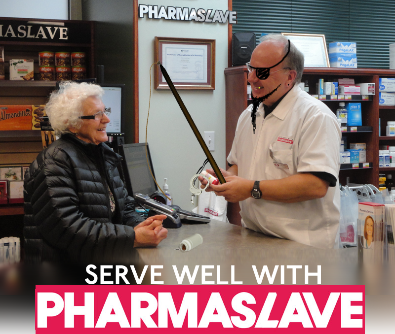
Technical: I split letters apart to create the Ls in Pharmaslave. I figured I wouldn't be able to find the fonts through searching, or at least it would have taken far too long. Cutting and copying was the best choice. Getting the logo in there at the bottom required me to copy/paste the lower part of the photo and stretch/blur until it looked acceptable. I figured it would be better than having the photo stop abrubtley to fit the logo in.
Idea or Concept: I got the idea while walking through the hallways. Seeing a girl wearing her "pharmasave" uniform I laughed to myself, calling it "pharmaslave". Then I figured I'm a genius and used it as my adbuster. My ideas consisted mostly of handcuffs/pharmaslave logos in order to convey the theme. As I progressed I figured it would be good to show a pill bottle with handcuffs spilling out, to show how much control drugs have over the average consumer. We're an overmedicated society in my opinion.
Influences: I really liked the Coca-Cola adbuster with the bottle of Coke being shot at the asian man. I wanted to show something like that. Maybe I'll redo this assignment later with a darker theme or picture.
Composition: Most of the focus is actually in the middle of the picture. Although I did adjust things in other places to subtley show the control medication has over the consumer. Most of the focus is in the center and after a quick look you're essentially done looking. I'm actually fairly disappointed with this image despite having a good idea to begin with. I would definitely redo this assignment with the same "pharmaslave" idea and a different, darker theme.
Motivation: Personally I loved my idea and wanted to see it into fruition. It would have been a pretty funny, clever thing had I been able to show it better. I believe I'm going to sketch something out soon as I'm getting a much better picture in mind the more I think about it. In the end my motivation had been drained and I started playing with the image. This is why the slave driver (cashier) is a pirate. I want to explore what slavery would look like offered through pill bottles.
Critical Assessment: I'd say the pirate's face is one of the most successful parts of the image. Terribly funny looking. Otherwise I'm proud of the big "pharmaslave" up at the top of the image, because I had to adjust pre-existing letters and shift everything over, manipulating shadows and the wall in order to make it look real. The pirate part was definitely the most surprising part of the piece. I was not expecting it to look good, and I'm glad it exceeded those expectations! I kept it in for its light tone and humour, and it even fits pretty well. With additional time I would redo the entire assignment. There would be a man on a stage pouring a bottle of pills over a crowd. The pills would expand and a giant dark hand would be layed overtop of the pills. The crowd would be cheering with handcuffs on their wrists, casts and other assorted medical problems. Pills being the "answer" to all of them, with a single smiling man handing out everything. This would far exceed my current picture.
Subscribe to:
Post Comments (Atom)

No comments:
Post a Comment